CECILIA'S PORTFOLIO

Sarnies Sandwich
I picked a project that is a food ordering service and related this to a real-life scenario case - I called this shop Sarnies.
Sarnies is a regional sandwich establishment & located in the financial districts. They strive to deliver superior; quality sandwiches and provide the flexibility for people to first choose the kind of bread, filling; condiments, and dressing. They target busy professionals. Currently, Sarnies do not provide any ordering app; the existing website only provides information about the company.
Project Duration - Feb 2023 to Mar 2023 around a couple hours a day
The Problem
The company is facing challenges as there is always a long queue at core hours and customers tend to leave the premise before they even order. Currently, Sarnies do not provide any ordering app and the existing website only provides information about the company.
My Role
UX researcher as well as UX designer designing an app for Sarnies from taking an idea to reality by exploring UX Research Methods & leveraging the UX Design Framework.
The Goal
Sanies have conducted several activities to empathize with users, define their problems, created wireframes & developed prototypes. The company is determined a website/app must be in place and the goal of this project is to consider the effectiveness of the design so that customers can seamlessly order & schedule their pick-up time.
Responsibilities
From research, competitors’ analysis, conducting interviews, paper & digital wireframing, presentation and low/ high-fidelity prototyping to conducting usability studies. Include accessibility and iterating on designs to ensure they conform to the WCAG standards.
Methodology
The methodology used is based on UX Design Framework - Design Thinking Process. The attached listed the actual processes I took as well as the deliverables created in each stage of the framework Not all the deliverables are attached here in the case study but kindly reach out if you need specific information.

User Research Summary
I conducted interviews and have identified all the information that can be put forward to an empathy map. Several groups are being identified but will focus on a primary user group here which is young professionals working in commercial centres.
This user group confirmed initial assumptions about Sarnies' customers, these people have tight schedules due to their work nature and always need to make quick food orders from outside and consume at work, possibly at their desk or in the office pantry. This group makes regular visits to Sarnies due to the loyalty incentive given.
Research also revealed this group compare their ordering experience to the technology experience they encountered at work and even from other restaurants that already have mobile ordering services.
User Pain Points
01
Long Waiting Time
Ususally spend 1-2 mins reading the menu before ordering. Shop assistance need to ask about their choices verbally one by one while preparing for the order. Each order would take up to >5 mins per order excluding the time you have to wait in line.
03
Mislaid Loyalty Card
The shop gives out physical paper loyalty card. The card is small, and customer keeps mislaying or losing them.
Breakfast and group order does not count towards loyalty.
02
Complex Group Order
Difficult group ordering service. First the catering menu is not very clear with their items. A completely different process for ordering. Call in then email/WhatsApp making customer completely avoid ordering from Sarnies.
04
No App Ordering
Currently all ordering have to done physcially as no alternative available.
Waiting time seems to be avoidable and customer by-pass this issue by going before /after core hours.
From Ideas to Final Wireframe Selection
Based on the competitive audit. The design has to be clean and neat providing a seamless ordering process. In addition, it will have a 1-click re-order, feedback incorporated and with reward option. Brand awareness has to be fulfilled during the design process and all these are the core components, hence the ideas. The final version is selected for prototyping.

Ideas

Final
Design and Functionalities Thought Process
These features are considered in the design phase as these will solve user frustrations.
Quick and seamless ordering process to save time for the customer. Enhanced icons with attractive pictures to enhance user experience.
Fast default pickup time of 15 mins but the user has the flexibility to change this.
Redemption available will be automatically shown up during the payment process. Users can also sign on to the Reward option in the bottom button to check loyalty information as well.
Leverage the current app to accommodate group orders.
From Paper Wireframe to Digital to Low Fidelity to High Fidelity to Mock up
From paper to digital wireframe is easily achieved by doing it in Figma. Then going through iterations of designing and testing before the final mock-up is achieved. The work looked a bit tedious at first due to consistency changing and conforming to standards at different stages due to design & test outcomes. Looking back, it was all necessary and a great enjoyment when the final version is done. The final product is all conforming to the WCAG standards, and all visual design elements are considered (type classification, typeface, fonts, colours & iconography), scale & proportion, balance layout & other elements to ensure they comply with the Gestalt principle.
I have chosen to use iPhone SE as the screen will be small. If the design can fit here, it should be able to re-size in other phones without too much problem.
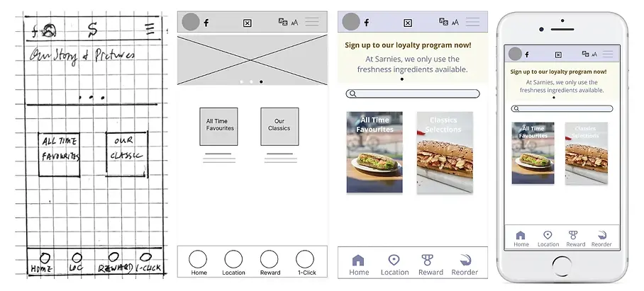
Screens and design evolvement
Colour Theme
Fonts
Based Colour Themes and Related

Open Sans 15
Open Sans 16
Montserrat 16
Montserrat 22
Other colours for buttons & wordings
Blue 346AF7 Brown 86553F
Red EB001B Orangish DBB657
All recommendations and suggestions incorporated in the design after two rounds of usability studies
Whether it is a Priority 0 (P0), Priority 1 (P1) or Priority 2 (P2) item, all modifications and fixes have been applied. P0 are items that must be fixed before the product can work. P1 are items that should be considered in the future release and P2 are those that could be addressed later. In fact, during the two usability studies, there are not any P0 items as they have been tested thoroughly before showcasing to the participants.
Round 1 findings
-
Enrich food content & ingredient.
-
Additional features for the menu page
-
Attractive redemption section, use images over words.
-
Additional payment methods
-
More pronounced and vivid status bar
-
Enhance rating functionality.
-
Facilitate easy change to the last order.
-
Enrich map & location functionality.
-
Miscellaneous features to make the app more enjoyable & useful.
Round 2 findings
-
Warn user that date of birth has to enter in order to qualify for birthday freebie
-
Enrich menu to choose from sandwich to a wrap or salad.
-
Enhance the Ingredient & Nutritious page to include information content for sandwiches/wrap & salad
-
Include sending a QR code link for group collection.
-
Add calendar and default to today's date for pickup.
Highlight Some Changes During Mock up
1. Before the usability study, users can only choose sandwiches from the menu. After the usability study, changes have been made and users can now select sandwich, wrap as well as salad from their selected item.

2. Before the usability study, ingredients and nutritious information are only for sandwiches as they are the only items. After the usability study, corresponding information has been added as horizontal items for easy viewing.

3. Before the usability study, the “build’ frame exists only for sandwich. After the usability study, the corresponding build frames have been made for wrap as well as salad as well.

4. Before usability study, the consideration is mainly focus on individual order. A simple frame has been put in so that the link of the pickup QR code could be send to the pick co-ordinator for bulk collection. Information has been added to the menu and a new screen has been added.

5. For the reward programme, users will able to redeem a free meal deal on their birthday but the field is not mandatory meaning they will miss out this offer. After the usability study, text has been added to warn users, also making this a mandatory field.

Sample Mock up Pages
There are few a selections I can choose here but have selected these four for illustration

Links to Prototypes


Accessibility Considerations
01
All the text contrast are comply with the WCAG standards
03
Including bilingual capability for Chinese language translation (this is still too early at this point but already pencil in under the menu items)
02
Heavy use of recognisable icons to ease navigations
04
All colour contrast are comply with the WCAG standards
What I learned
The whole process from taking an idea to producing a proper high-fidelity prototype by using Figma. I have also tried to use Marvel too but seems like Figma is more flexible as fewer limitations e.g., the number of projects. In addition, I have also learned about the UX Design Framework, design thinking & putting it into action throughout the whole process.
Lots of time has been spent during this study and at first, it was quite tedious to go through the re-design for text font/colour changes from the low-fidelity prototype to the high-fidelity prototype and making sure all conformed to standards but in the end, it was worth it. For low fidelity, it was supposed to be an initial design and should be less complex, but I started with most functionalities in mind already during the initial stage and thus making a complex start off, then again it is worth it as I reckon changing and adding new functions at a later stage would be quite hard, especially during the high-fidelity phase. Also, I have not used any of the community tools and re-do everything from scratch as this would be the best way to learn Figma (i.e., dive right in). Putting a case study on the web is also something new and it is a great experience to be able to learn something new every day.
There is room for improvement in the prototype for sure, but I am positive that this will be achieved with more practice as "practice makes perfect"!
Next Steps and Going Forward
01
In real life, we cannot give users all the payment options and need to do a proper investigation & survey to see which ones are popular. Also need to check into the charges each payment option would incur & decide on the feasible ones.
02
Would love to see this product come to life and the next step would be to send it to the developers to code. Being able to learn the theory but apply it to real life is a great way to thoroughly understand the subject.
03
Check into the bilingual translations. This should be done once the English version is completed. We need to accommodate those users who are more comfortable with Chinese and less fluent in English.
I welcome all comments and not all the work related to this case study is listed. If you need to know more about any part of the details and the work I did, kindly click and reach out.
What Did They Say
